Jizô AI
Overview
Founded in 2017, Sesame IT is a French company specializing in cybersecurity solutions, focusing on the detection and response to threats on IT and OT (Operational Technology) networks. Its mission is to help European companies and organizations anticipate, identify, and block cyberattacks in real time. Among its flagship products is Jizô NDR, a network monitoring solution that enables decision-makers to better manage cyber risks.
The objective of the mission was to challenge the existing platform and propose a redesign to prepare it for a fundraising round, while enhancing its attractiveness to potential investors.
My contribution
UX research UX design UI design
The team
1x UX/UI designer
Year
2024

Process
Initial Problem
Despite its technical performance, the previous version of Jizô AI had limitations in terms of user experience:
• Information Overload: Users faced an influx of unprioritized alerts and data, making it difficult to quickly identify critical threats.
• Unintuitive Navigation: The lack of a clear structure complicated access to essential functionalities, increasing the time required to perform key tasks.
• Insufficient Visual Differentiation: The danger levels of alerts were not clearly distinguished, creating confusion and potential security risks.
These issues impacted the operational efficiency of security teams and their ability to respond promptly to threats.
Methodology
A comprehensive audit was conducted and revealed the following issues:
• Poor Prioritization of Alerts: Critical alerts were not highlighted, leading to delays in responding to threats.
• Complex Navigation: The absence of a clear menu forced users to navigate non-linearly, increasing time and effort.
• Lack of Visual Differentiation: The color codes and icons used did not allow easy distinction of danger levels.
• Accessibility Issues: Insufficient contrasts and non-optimized typographies made reading difficult, especially in dark mode.
Redesign Process
1. User Interface Redesign
We began by creating a UI kit to define the new colors and typographies for the platform, establishing a coherent visual identity. This kit served as a guide to harmonize the overall aesthetics and improve readability, notably in dark mode.
Next, we developed reusable components for each element of the dashboard, such as buttons, icons, forms, and graphs. This approach ensured visual consistency across the platform, facilitated maintenance, and accelerated the development of new features.

2. Navigation Optimization
An intuitive side menu with a hierarchical structure of sections was introduced. This modification aimed to simplify access to various functionalities and reduce the number of clicks. Additionally, it makes the menu easier to maintain over time. The expected result was improved navigation efficiency and a decreased learning curve for new users.
3. Dashboard Temporality
One of the essential aspects to improve from a UX perspective concerned the management of temporality. The previous interface displayed indicators like “12h” and “24h” without providing a precise temporal reference to help users orient themselves. Moreover, different sections of the page could use inconsistent time periods.
To solve this problem, we introduced a period selector at the top of the page, allowing users to choose a period that coherently affects all page elements. Additionally, a clear indicator of start and end dates was added, enabling users to easily capture an overview with precise temporal information if necessary (e.g., for screenshots or reports).
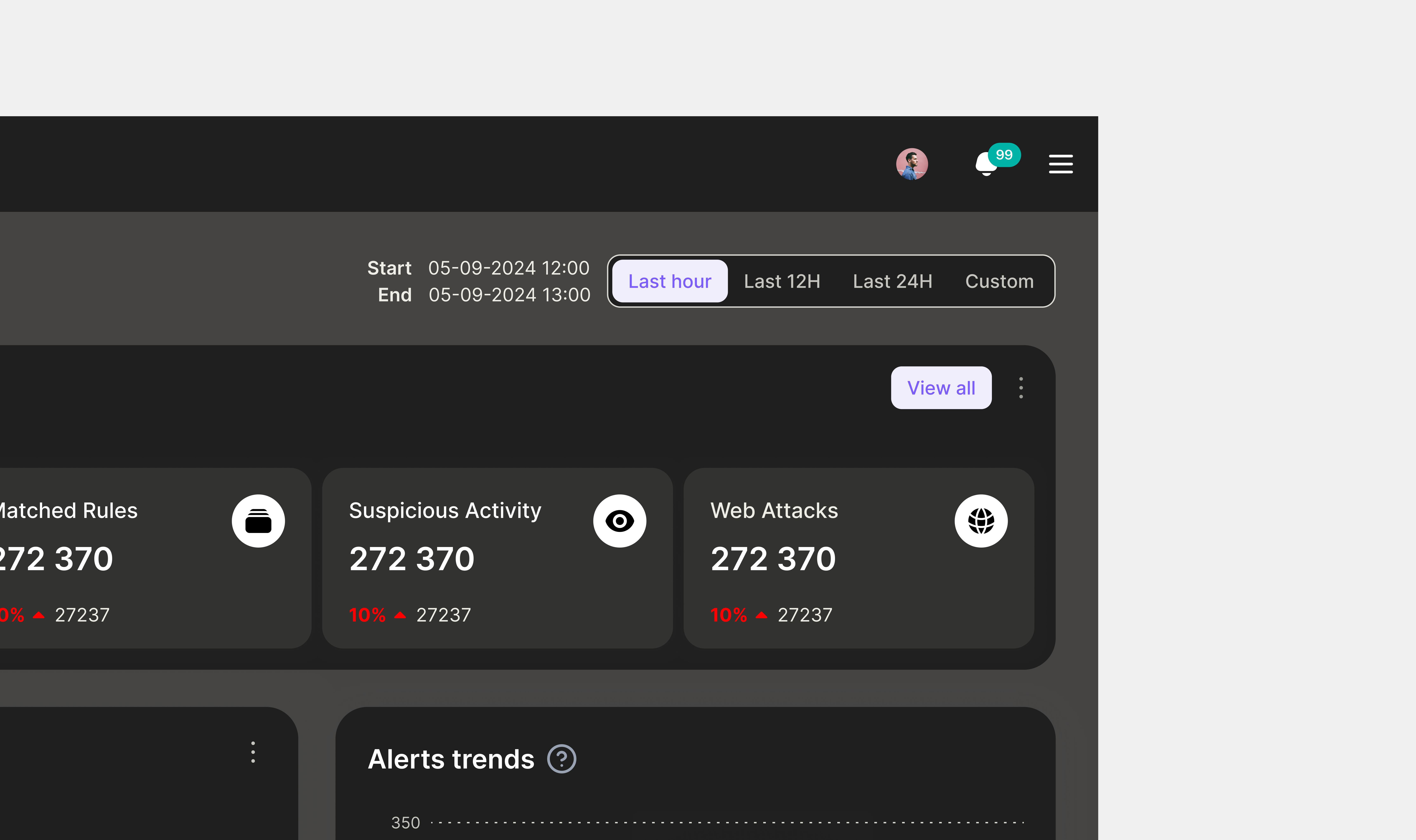
4. Prioritization of Key Performance Indicators (KPIs)
Continuing this rationalization, we repositioned the KPIs at the top of the homepage, limiting the main display to four key indicators to ensure immediate visibility. The other KPIs are now accessible via an accordion, thus avoiding overloading the interface while allowing quick access to additional information. This decision aimed to facilitate decision-making by reducing the time required to identify priority threats.
Furthermore, there was a lack of trend indicators to inform users of points of attention. To address this, we added trend indicators expressed as percentages, offering a better understanding of the evolution of critical data and helping users anticipate risky situations.

5. Information Synthesis
We rethought the presentation of graphs related to alerts. Instead of having three or four separate graphs for different alert levels, this information was consolidated into a single graph grouping all levels. The objective was to group related information to obtain a clearer and more coherent interface, improving data readability and facilitating overall analysis.
6. Accessibility Enhancement
Finally, contrasts were improved and typographies adapted to dark mode were selected. This aimed to increase readability and visual comfort, especially for users working in low-light environments.

Outcome
The redesign of the Jizô AI platform significantly improved user experience, operational efficiency, and customer satisfaction. By adopting a user-centered approach and integrating proven design practices, we addressed the initial challenges and strengthened Jizô AI’s position in the cybersecurity market. This experience highlights the importance of flexibility, collaboration, and commitment to excellence in developing technological solutions.